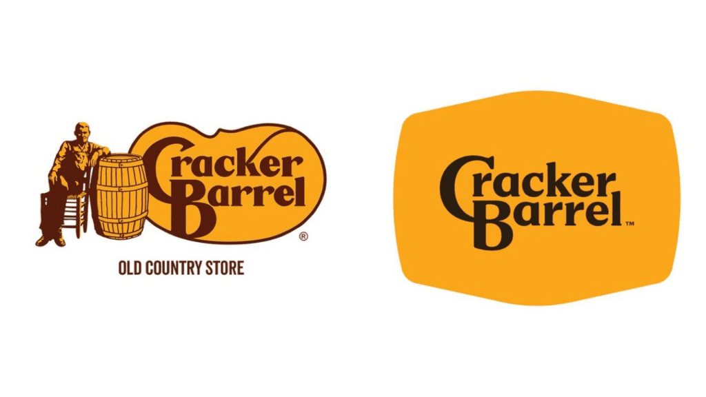
CRACKER BARREL DITCHED ITS BELOVED “MAN BY THE BARREL” LOGO FOR THE FIRST TIME IN 48 YEARS—AND THE INTERNET CAN’T DECIDE IF IT’S GENIUS OR SUICIDAL
There’s something bittersweet about change, especially when it touches something familiar. I still remember walking into Cracker Barrel as a kid, settling into a rocking chair on the porch while my plate of biscuits and gravy made its way to the table. That chain of cherished moments—the rocking chairs, the gift shop, the smell of fried chicken in the air—always began with one image: the logo of the man leaning on a barrel. For nearly five decades, it stood as a symbol of homegrown comfort. And now, it’s gone.
Cracker Barrel just unveiled its first logo redesign since 1977. The company retired the iconic figure by the barrel and replaced it with a modern wordmark that nods back to the barrel shape but strips away all the old-time detail. It still keeps the familiar gold and brown colors, but now it’s cleaner, sharper, and undeniably more corporate. The move is part of Cracker Barrel’s new “All the More” campaign, which aims to modernize the brand while keeping its roots in Southern hospitality alive.
The rollout hasn’t been quiet. Alongside the logo, the company is remodeling stores with lighter, farmhouse-inspired décor, brighter interiors, and fewer antiques on the walls. About 40 locations have already been revamped, with many more on the way. The menu is changing too, with seasonal dishes like Hashbrown Casserole Shepherd’s Pie and Butter Pecan French Toast Bake making an appearance. And to celebrate the shift, Cracker Barrel is even offering free Classic Sides with purchases on August 23–24, while teaming up with country singer Jordan Davis to front its promotional campaign.
Still, not everyone is celebrating. Fans across social media are mourning the loss of the old man-by-the-barrel logo, calling it a piece of nostalgia that should have never been touched. Some say the new look erases the warm, rustic identity that made Cracker Barrel special, reducing it to just another modern chain. Others have gone further, threatening boycotts and vowing to never step foot inside again. For them, the new design isn’t just a logo—it’s the loss of a memory.
But there are voices of support too. Some customers welcome the change, saying the brighter décor and updated branding make Cracker Barrel feel less cluttered and more inviting to a new generation of diners. Company leaders echo this sentiment. CEO Julie Felss Masino insisted in interviews that “our story hasn’t changed, our values haven’t changed,” describing the updates as a way to honor the past while keeping the brand relevant for the future.
The truth is, change is always complicated when it comes to nostalgia. For many, Cracker Barrel was never just a restaurant—it was a comfort, a place to slow down, to feel at home. Stripping away an old logo feels almost like letting go of that memory. But perhaps this rebrand is a chance to blend old and new: to keep the spirit alive while refreshing the look for a different era. Whether customers embrace it or reject it, one thing is certain—after nearly 50 years, Cracker Barrel has turned a page, and the brand will never look the same again.